OBJECTIVE
The agency wanted to understand my thought process, design, and presentation skills. The solution was not expected to be finalised but in this role, UI plays a big part.
The assignment brief (and business goal) was:
Your client is a well-established fashion label. How might they provide a superior shopping experience? Reimagine the fashion retail experience for existing customers (Gen X) and reach new audiences (GenY/ Millennials).
The client is keen to explore a digital store experience that integrates with the physical store. Think about each customer interaction as an opportunity to build a relationship with the brand.
UNIQLO was selected as the ‘client’ as it is a popular brand. With just seven days to deliver, I was at least confident in finding enough people to interview and survey.
Evaluation Dimensions
- Ideation – Originality & creativity
- Execution – Quality & output
- Elaboration – Evolution of concepts
- Innovation – Differentiated & futuristic
- Communication – Articulation & storytelling
Deliverables
- Summary of CX/UX approach applied
- 2 personas (minimum)
- Customer journey
- Initial sketches/ideas
- 1 digital user flow (for primary use-case)
- 1 hi-fidelity visual design of a clickable prototype for a selected flow of screens across mobile and desktop
- Presentation deck for an audience not from the design industry.
Role
UX/UI Designer
Duration
7 days
Tools
Figma, FigJam, Otter.ai, Photoshop, Google Forms
PROCESS
I approached the assignment by applying design thinking – an iterative, evidence-based, human-centered methodology. There are five steps to this approach:
EMPATHYConduct user research to understand user needs, motivations and pain points. Determine if patterns emerge. |
DEFINEFocus and identify areas to address. Craft user personas. |
IDEATEBrainstorm ideas. Determine which idea balances user needs, business goals and technical feasibility. |
PROTOTYPETurn ideas into solutions, culminating in a prototype for our users to test. |
TESTTest the prototype by asking users to perform tasks with it. We observe how they interact with it and obtain feedback. |
EMPATHY
USER RESEARCH (QUALITATIVE)
Who are Uniqlo’s customers? I started by doing user research. As Uniqlo is a popular brand, I had little difficulty approaching friends and relatives to conduct USER INTERVIEWS as a means of QUALITATIVE RESEARCH. This process helps me understand their needs and motivations.
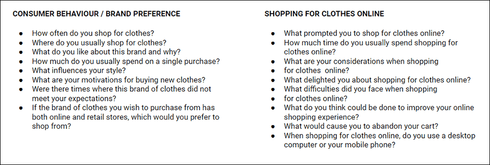
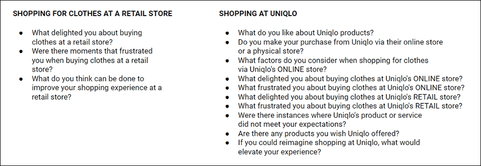
I crafted different categories of questions to understand the customers’ behaviour and attitudes towards shopping for clothes via online and retail channels. And just as important, their perception of and their experiences with Uniqlo.
Using the same set of questions, I interviewed 5 Uniqlo customers.
5interviewees |
29-48age |
4+1women / man |
30mduration |
USER RESEARCH (QUANTITATIVE)
I also ran a survey using Google Forms as QUANTITATIVE RESEARCH. I crafted different categories of questions to understand the customers’ behaviour and attitudes towards shopping for clothes via online and retail channels. And just as important, their perception of and their experiences with Uniqlo.
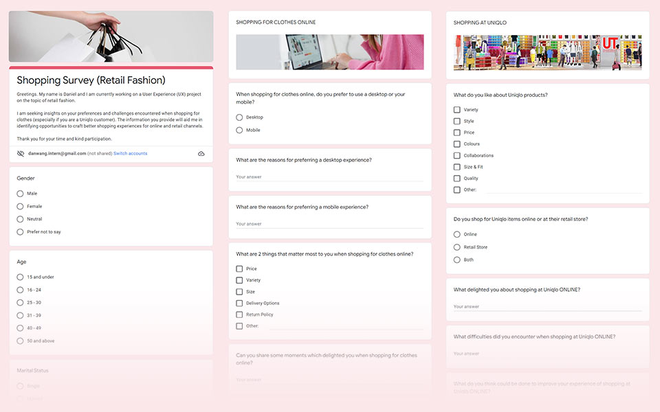
I received 47 responses to my survey.
After the interviews and survey, I synthesised the comments and grouped the pain points into themes to form an affinity map. The comments are now translated into insights.
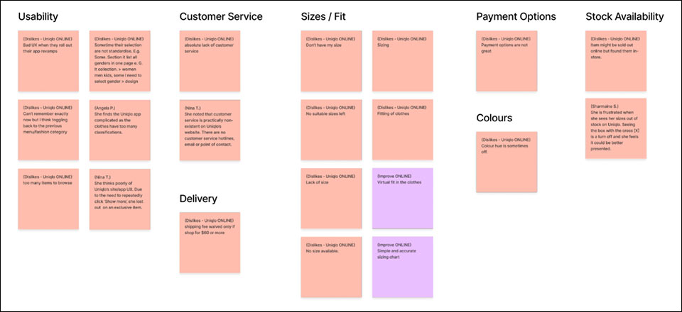
Above: Affinity mapping for pain points encountered when shopping at Uniqlo ONLINE.
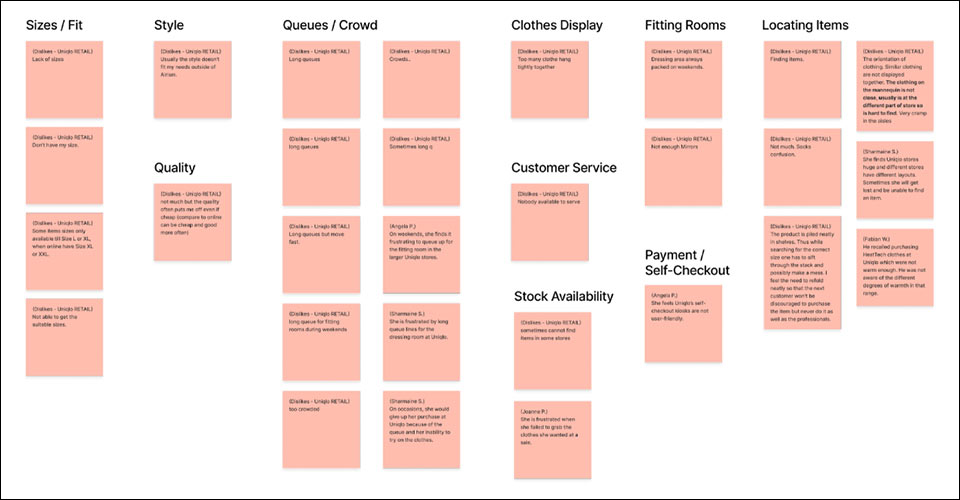
Above: Affinity mapping for pain points encountered when shopping at Uniqlo’s RETAIL STORE.
Uniqlo online store pain point themes
- Usability
- Customer Service
- Delivery
- Sizes / Fit
- Payment Options
- Colours
- Stock Availability
Uniqlo retail store pain point themes
- Style
- Quality
- Queues / Crowd
- Clothes Display
- Customer Service
- Stock Availability
- Fitting Rooms
- Payment / Self-Checkout
- Locating Items
DEFINE
NARROWING DOWN WHAT PROBLEMS TO SOLVE
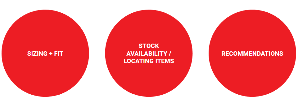
The user research is done and I have gained insights to the user’s pain points. Logically, I should address the issues with the most pain points. Although fitting room queues and store crowd on weekends were major concerns, I have little control over crowd management. Drastically limiting the number of clothes a customer could try would be a turn-off.
The issues in the circles below have been identified as the ones to solve. However when we ideate, we might come up with solutions that address pain points beyond these.
DETERMINING THE USER PERSONA
While it is good to narrow down the issues to address, we also need to better visualise a personality who is representative of our customers. In essence, a user persona. While the persona is not a real person, the persona’s traits, needs, motivations and frustrations are very real (distilled from the people I interviewed). I created personas for the two customer segments: Generation X and General Y / Millennials.
Let’s get acquainted with them.
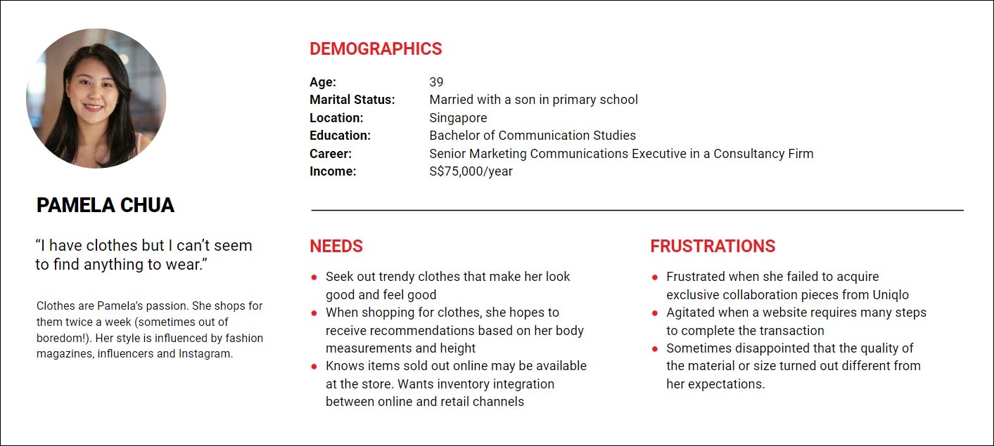
Above: User persona for Gen-X customers – PAMELA CHUA
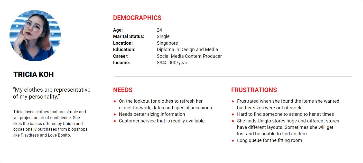
Above: User persona for Gen-Y customers – TRICIA KOH
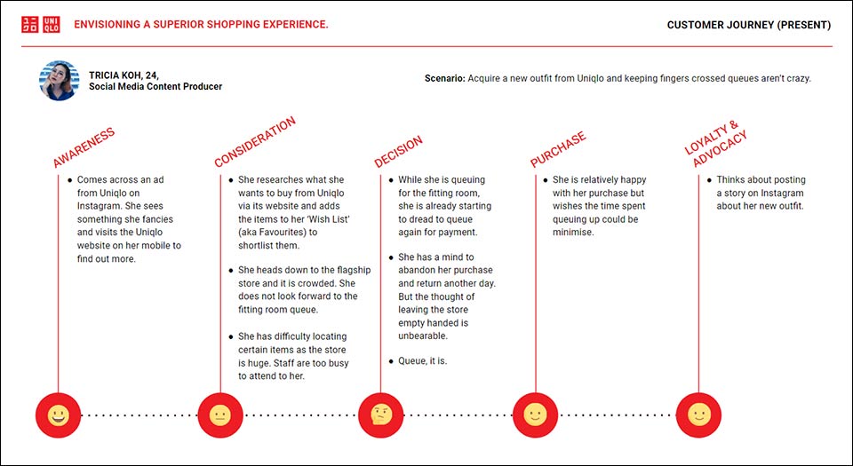
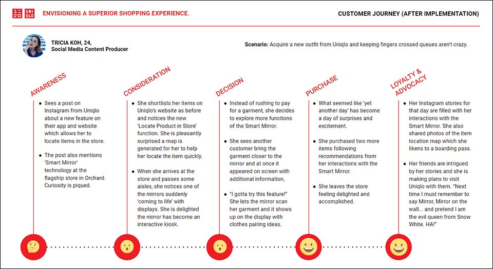
In this assignment, the Gen Y user persona will be my primary customer. Let’s explore Tricia’s existing customer journey with the simple scenario of acquiring a new outfit from Uniqlo.
USER JOURNEY
Tricia’s pain points, brand touchpoints and emotions are recorded at each stage of her journey as a Uniqlo customer
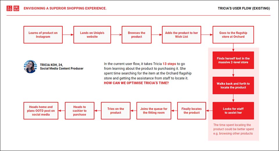
USER FLOW
In the current user flow, it takes Tricia 13 steps to go from learning about the product to purchasing it. She spent time searching for the item at the Orchard flagship store and getting the assistance from staff to locate it. HOW CAN WE OPTIMISE TRICIA’S TIME?
IDEATE
“HOW MIGHT WE…”
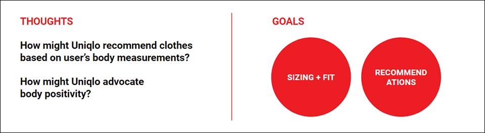
At this stage, it is a good idea to start asking some “How might we…” questions to help us frame our approach in developing solutions.
-
How might Uniqlo recommend clothes based on the user’s body measurements?
-
How might Uniqlo advocate body positivity?
-
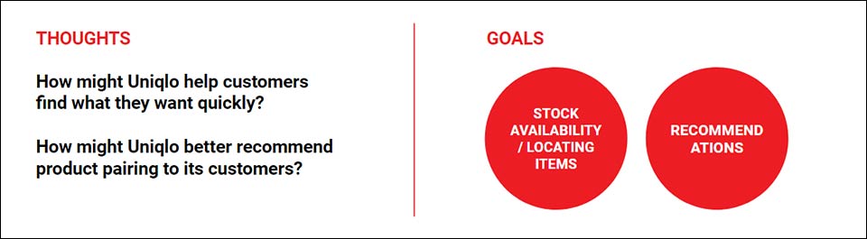
How might Uniqlo help customers find what they want quickly?
-
How might Uniqlo better recommend product pairing to its customers?
IDEA #1 – RECOMMEND CLOTHES USING USER’S BODY MEASUREMENTS
For my first idea, I wanted to address clothes recommendations by utilising the user’s BODY MEASUREMENTS. I was aware of a body shape classification for women and considered advocacy for body positivity.
I wanted to introduce the concept of body shapes for Uniqlo Women’s clothes. By entering their body measurements in a calculator, their body shape type could be generated and clothes can then be recommended to them.
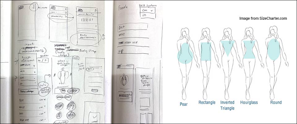
To validate my idea, I did a zoom call with one of the five users whom I interviewed. While she was appreciative of the idea of Uniqlo recommending clothes based on her body measurements, she was not keen on being labelled ‘Rectangle’ or ‘Pear’ body shape.
IDEA #2 – ITEM LOCATOR
For my second idea, I looked into implementing a new feature in Uniqlo’s website and mobile app to let customers LOCATE PRODUCTS IN THE STORE by means of generating a map for them. I also thought about ways to engage customers digitally at Uniqlo’s retail stores.
Some survey respondents and people I interviewed lost their way in bigger Uniqlo stores, especially those with two levels. They expressed a need for better directional signages.
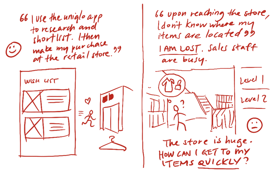
The illustrations above depict a customer who uses Uniqlo’s app or website to shortlist for items before heading down to an outlet to purchase.
However upon reaching the outlet, she could not find her way around and had difficulty finding a staff to attend to her.
How can I ease her frustrations?
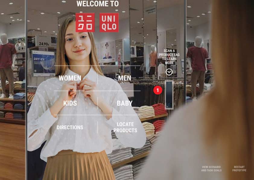
IDEA #3 – INTERACTIVE SMART MIRROR
The business goal mentioned ‘the client is keen to explore a digital store experience that integrates with the physical store’. With this in mind, I am thinking of implementing an interactive smart mirror.
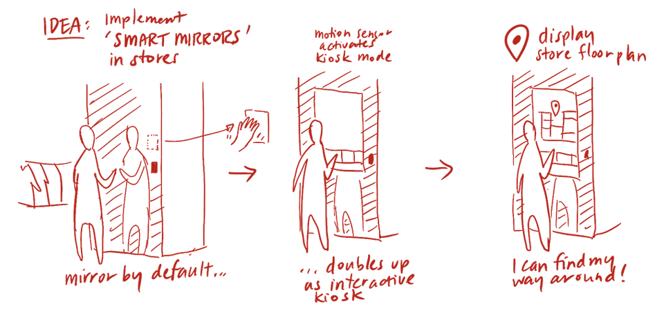
It is essentially a mirror which doubles up as an interactive kiosk. While the technology is not new, the concept is novel and can drive user engagements at the retail store.
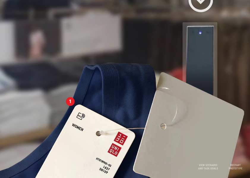
The idea is that the user is able to self-help by utilising the smart mirror. She can browse apparel and even use the Radio Frequency Identification (RFID) scanner mounted on the mirror to scan the RFID tag of a product. The product will instantly appear on the screen and she can even view recommendations for product pairing.
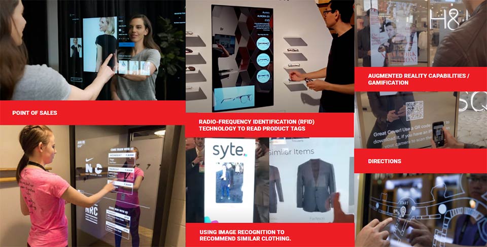
Above: A variety of uses for a smart mirror
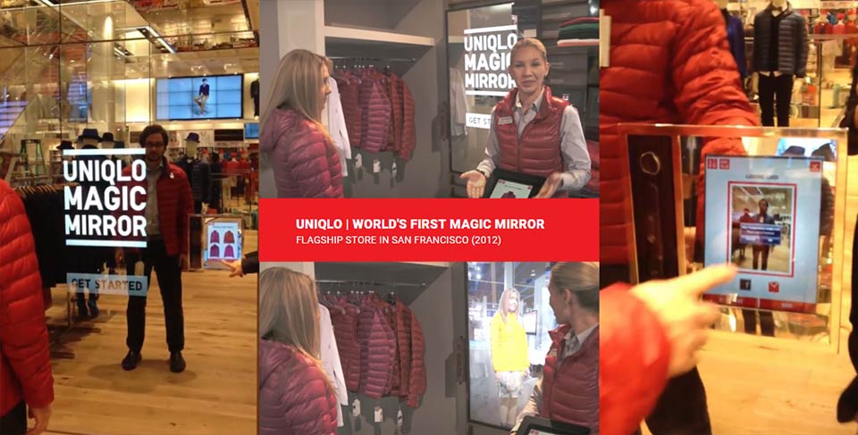
Above: Not a new technology: Uniqlo’s Magic Mirror – a world first in their flagship store in San Francisco (2012). Beyond clothes fitting by augmented reality, there are also other possibilities for customer engagement.
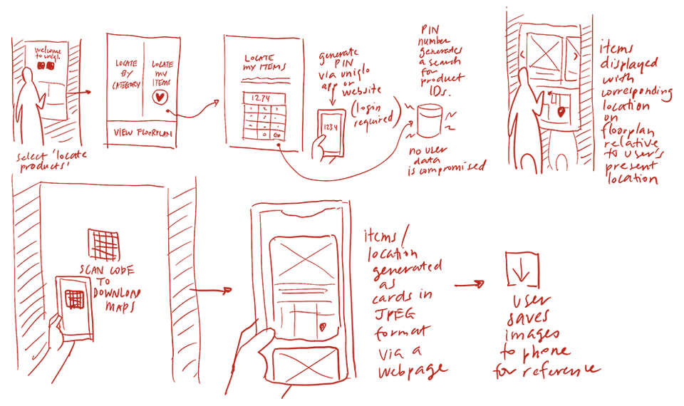
FEATURE EXPANSION
Via the smart mirror, the user can also locate items in the store by entering the 6-digit Product ID number. A map will then be generated to help the user navigate around the store to find the item. The map will be generated as a JPEG and the user can save it to the device for reference. In this regard, there is better synergy between online and offline touchpoints.
Again, I needed to validate if my idea was sound. And I approached the user again to seek her opinion. To her, this idea actually solves multiple pain points:
- With this smart mirror, she gets customer service whenever she needs it.
- It helps her locate her items quicker than before.
- By scanning the RFID tag of a product, she also gets recommendations on screen for product pairing which is a big plus for her.
WHICH IDEA TO GO FOR?
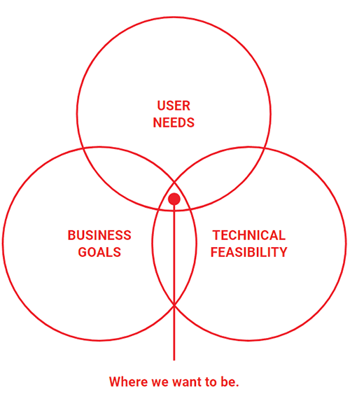
Between the two ideas and from user feedback, the second idea of the Smart Mirror and Item Locator was able to meet user needs, business goals and technical feasibility.
It was time to create prototypes for our user to test.
PROTOTYPE #1
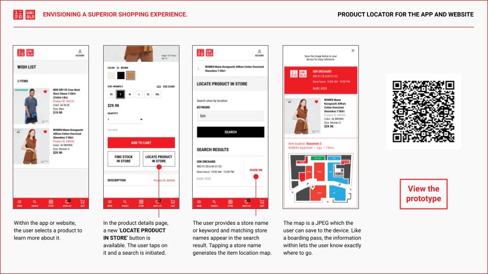
PRODUCT LOCATOR FOR THE APP AND WEBSITE
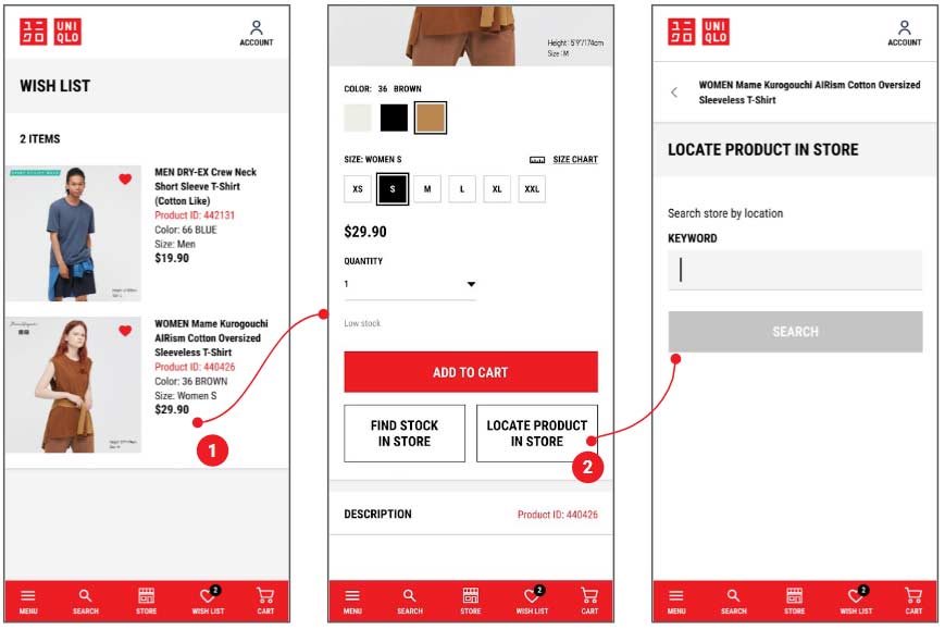
In the same discussion I had with the user, she pointed out that while it is good to have an item locator in Uniqlo’s retail store (via the smart mirror), she was hoping a similar function could be implemented for Uniqlo’s app and website. Her rationale is that before she heads down to the store, having an item she fancies located for her on a map would be helpful.
With this in mind, I have created a prototype which demonstrates this capability.
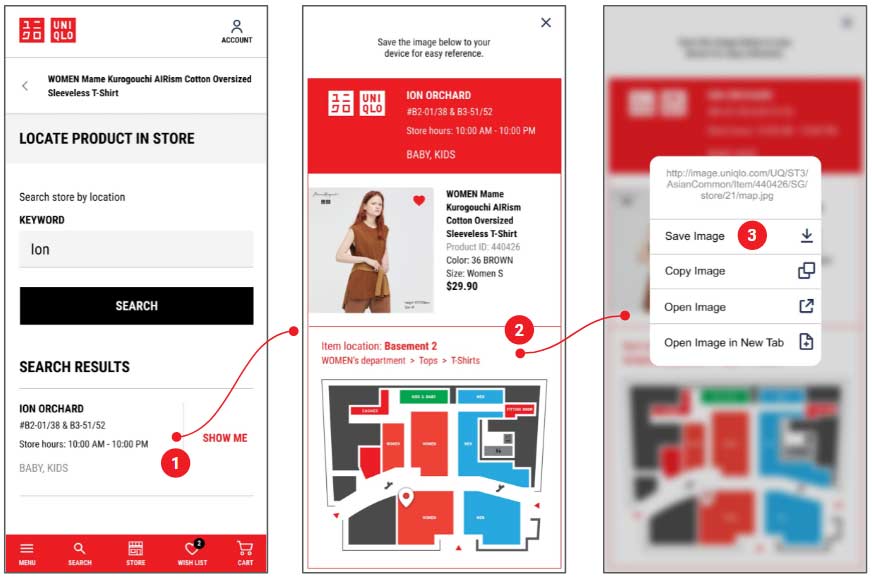
HOW IT WORKS
Within the app or website, the user selects a product to learn more about it.
In the product details page, a new ‘LOCATE PRODUCT IN STORE’ button is available. The user taps on it and a search is initiated.
The user provides a store name or keyword and matching store names appear in the search result. Tapping a store name generates the item location map.
The map is a JPEG which the user can save to the device. Like a boarding pass, the information within lets the user know exactly where to go.
PROTOTYPE PREVIEW
I created a high-fidelity prototype using Figma with the intention of conducting a usability test. Scan the QR code or click on the button below to preview the prototype.

PROTOTYPE #2
INTERACTIVE SMART MIRROR
As mentioned earlier, I have noted that smart mirror technology has been available for some time. The technology offers many possibilities and has potential for high user engagement. Budget aside, I am hoping the idea can at least spark conversations between stakeholders.
HOW IT WORKS
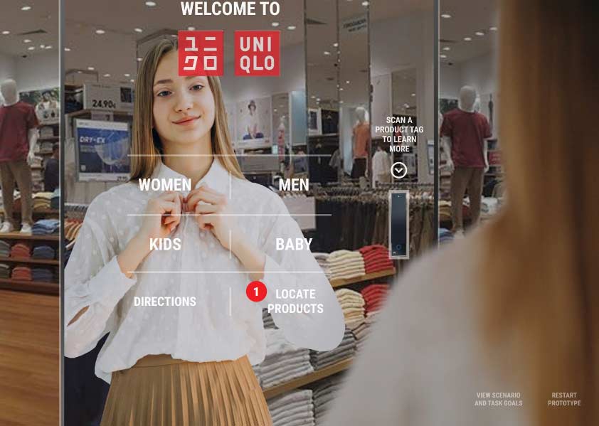
When a user approaches the mirror, proximity sensors detect the approach and launch a welcome screen.

The user is presented with a series of options to explore. She could browse for clothes, get directions within the store and even learn more about a garment by letting the smart mirror scan its Radio-frequency identification (RFID) tag.
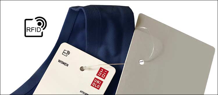
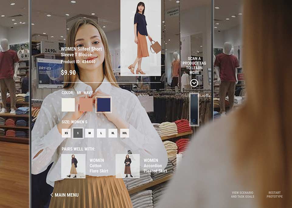
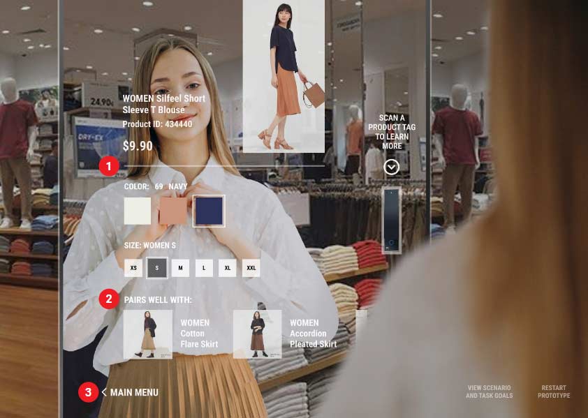
When the smart mirror scans the RFID tag of a product, it immediately displays the item on screen. The user can explore the colours and sizes available with ease. Product pairing recommendations on the spot can boost sales.
With this smart mirror, the user would not be annoyed by staff who ‘hover’ around them and overcome situations where there are seemingly no staff to assist the user.

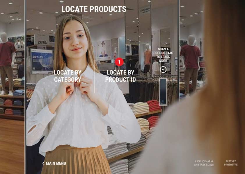
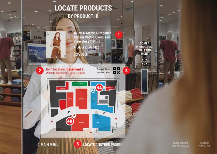
In this screen, the user is initiating a product search. She could search for items by category or simply locate products by their ID numbers.
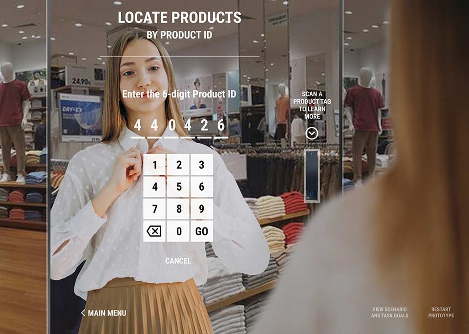
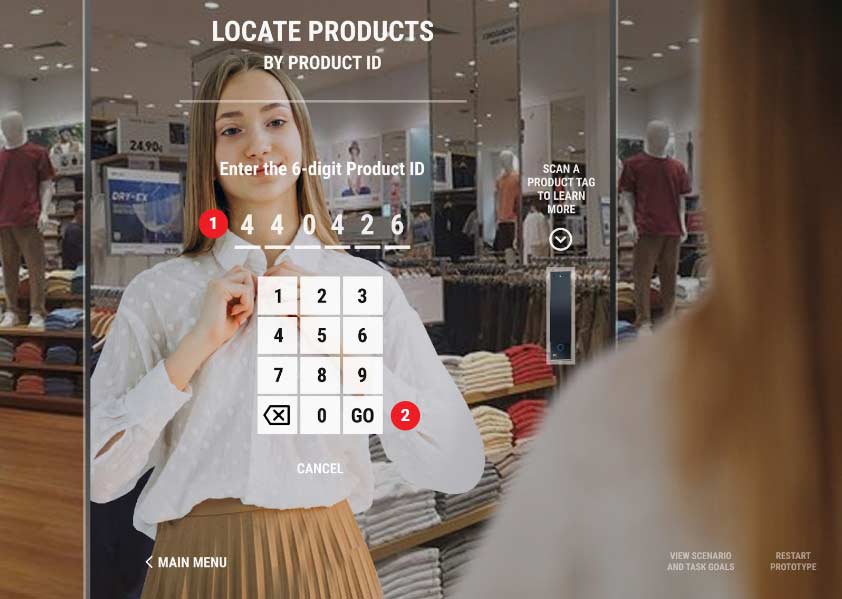
The large on screen numeric keypad is user friendly.
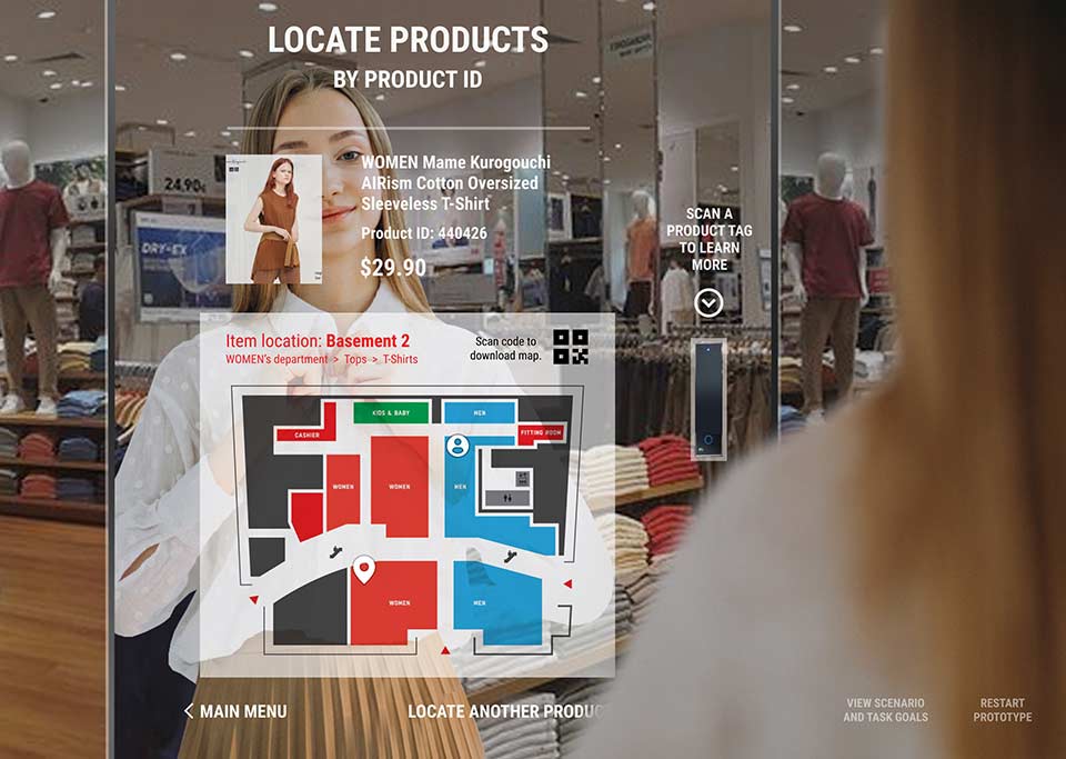
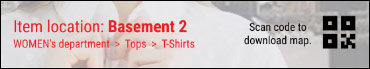
The corresponding product image shows up on screen along with a map with clear instructions. A QR code is provided for the user to scan and save the map of her phone.
PROTOTYPE PREVIEW

I created a high-fidelity prototype using Figma with the intention of conducting a usability test. Click on the button below to preview the prototype. Preview via desktop is recommended.
TEST
CONDUCTING USABILITY TESTS WITH THE PROTOTYPES
Once again, I invited the same user whom I interviewed before to help me test the prototypes. This ensures continuity in determining how effective these prototypes are based on her inputs from prior sessions.
Prior to the usability tests, I enquired with the user about her device type. This is important because we want the experience to be as close to the real thing as possible, down to mimicking behaviours of different phone operating systems.
Preview links were provided beforehand and a meeting was conducted via zoom for me to listen to the user’s feedback at each stage.
For each prototype, the user was briefed on the scenario and given a task to perform. This usability test will reveal whether actual user interactions met the expected outcome.
USABILITY TEST #1: PRODUCT LOCATOR FOR THE APP AND WEBSITE
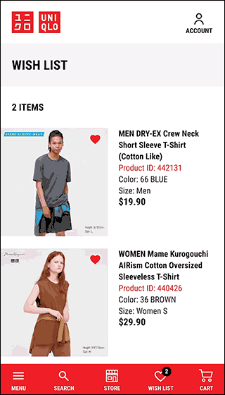
For this usability test, the prototype is a partial recreation of the Uniqlo Singapore mobile website. The user is briefed on the following scenario and task/goal.
SCENARIOUniqlo has implemented a new feature in its website which lets users locate its products in the store. |
TASKView a product and learn where it is located at the ION ORCHARD store you will be visiting. |
On the next few screens, we will see if the user’s task exploration matches the expected outcomes at each step of the process.
TASK 1
View a product details page and locate the product in the ION ORCHARD store.
USER ACTIONS
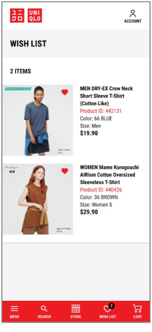
- The prototype begins with the WISH LIST screen. The user had no problem tapping on a product to view its details.
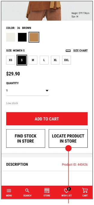
- In the Product Details screen, the user sees the LOCATE PRODUCT IN STORE button after scrolling down the page.The user tapped on the button and was brought to the LOCATE PRODUCT IN STORE screen which prompted her to input a store name.
TASK 2
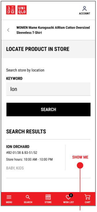
Input ION ORCHARD as the search keyword and obtain a search result.
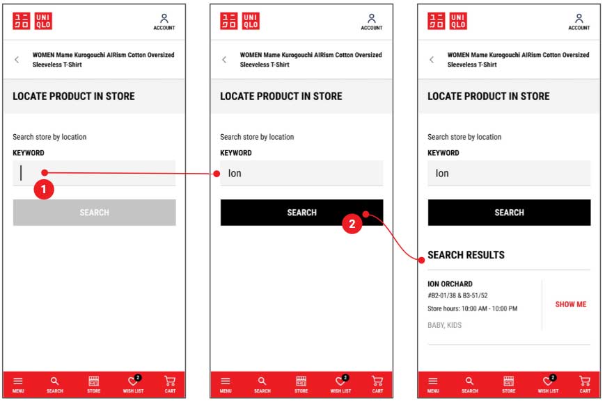
USER ACTIONS
- User noticed the blinking text input cursor and instinctively tapped the text input field.
- The keyword ‘ION’ is provided and the user tapped on SEARCH. ION ORCHARD appeared as a search result.
TASK 3
See where the product is located at the ION ORCHARD store. Save the product location map to the device.
USER ACTIONS
- User saw ION ORCHARD in the search result. She also noticed the text SHOW ME in red and tapped on it.
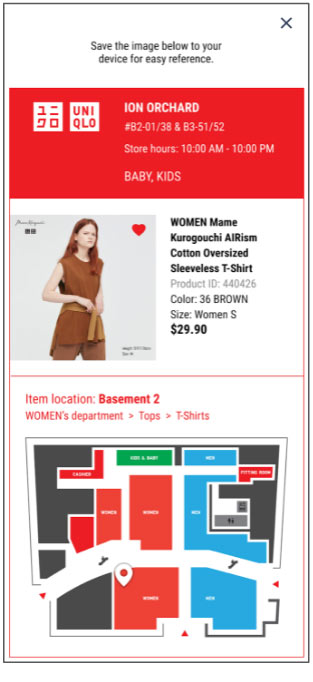
- A card (generated as a jpeg) containing information about the product as well as its location map at the ION ORCHARD store is presented in an overlay.
- When prompted to save the image, the user did a ‘long press’ and triggered a contextual menu. The user interface was familiar to the user and she tapped on ‘Save Image’.
COMMENTS AND OBSERVATIONS
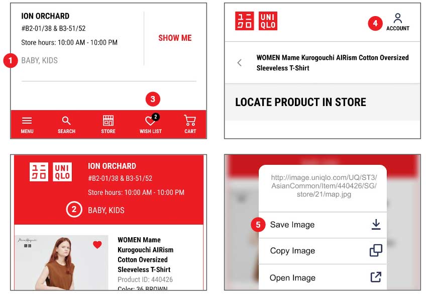
- The user commented that even though the ION ORCHARD store sells Baby and Kids products, this information was irrelevant to her at this stage as she is only concerned about the T-Shirt she is interested in purchasing and similarly in the generated location map.
- Similar comment as above.
- The user commented that the Wish List button in the red navigation bar was a blind spot to her (“Could just be me” she said).
- She tapped on ‘Account’ at the top-right corner to access the Wish List instead.
- User commented she mostly does screen captures on her phone to save useful information and that the map is a nice touch.
USABILITY TEST #2: INTERACTIVE SMART MIRROR AT THE STORE
For this usability test, the prototype is a mock-up of the smart mirror’s kiosk interface at the store. The user was asked to use her laptop view and try this prototype.
SCENARIOYou are made aware of Uniqlo’s smart mirrors at select stores via social media. Intrigued, you head down to a store to experience it for yourself.
|
TASK
|
On the next few screens, we will see if the user’s task exploration matches the expected outcomes at each step of the process.
TASK 1
Scan a product tag using the mirror’s RFID reader to learn more about the product.
USER ACTIONS
- The prototype begins with the main menu, presenting the user with several options.The user was asked to describe the options available to her on this screen. She noticed the tag reader on the right and clicked on it.
- To provide a faithful simulation, the view switches to a close-up view of the reader and depicts the user moving the tagged garment towards the reader to scan it.
TASK 2
Examine the product details and feedback whether the information presented is sufficient. Return to the main menu when done.
USER ACTIONS
- After scanning the tag, the product details are flashed on-screen. The user is ok with the presentation of the product details but commented the product price, colour and size are information she already knew before approaching the mirror.
At this screen, she felt it would be good to indicate stock availability for each size (to satisfy her curiosity) at this particular store. If stock is unavailable, she would like to know if the product is available at other branches.
- The user appreciated the ‘Pairs well with” product recommendations and will likely view them.
- The user clicked MAIN MENU, returning her to the initial screen.
TASK 3
Locate a product in the store by Product ID.
USER ACTIONS
- From the main menu, the user clicked on LOCATE PRODUCTS.
USER ACTIONS
- From the LOCATE PRODUCTS screen, the user clicked on LOCATE BY PRODUCT ID.
TASK 3
Using the product locator mobile web prototype from earlier, retrieve a 6-digit ID number of a product from the user’s WISH LIST and input it in this screen to initiate a product ID search.
USER ACTIONS
- The user retrieved the 6-digit ID number from a product in her wish list quickly. The red text colour provided a visual cue. The user clicked the numeric keypad which simulated her entry of the 6-digit product ID.

- Next, the user instinctively clicked on ‘GO’ to initiate the product ID search.
TASK 4
Examine the product information and the product location map. Feedback whether the information presented is sufficient. Locate another product.
USER ACTIONS
- The user found the product information sufficient.
- For the map, the user commented knowing the product’s location was sufficient for her and she does not need to see the ‘Tops > T-Shirts’ appearing behind ‘WOMEN’s department’.
- The user appreciated the map download QR code.
- (4A/4B) The user understood the map iconography – the profile icon represents the user’s present location while the location pin represents where she needed to go.
- The user clicked on LOCATE ANOTHER PRODUCT to initiate another Product Location search.
USABILITY TESTS SUMMARY
PRODUCT LOCATOR FOR THE APP AND WEBSITE
How did the idea help the user?
- User is able to determine the location of the product in the store before heading down.
INTERACTIVE SMART MIRROR AT THE STORE
How did the idea help the user?
- User learns more about the product by scanning the RFID tag
- User gets product pairing recommendations
- User can get assistance locating products in the store
What other solutions can the idea provide?
- Provides on-demand customer service for users who dislike staff who hover around them and yet want them to be readily available when needed
- View store floor plan
- Point of purchase
- Gamification
- Conduct Polls / Surveys / Feedback
- Can be fitted with cameras/sensors to scan body measurements and height
- Augmented Reality capabilities. Overlay clothing on users to help them visualise and shape purchase decisions
TRICIA’S CUSTOMER JOURNEY (After feature implementation)
Tricia’s experience is enhanced by the interactive mirror and she becomes highly engaged. She leaves the store feeling delighted and she cannot wait to share her store experience on social media.
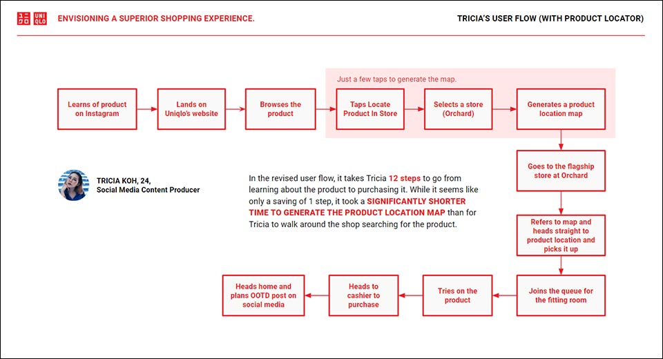
USER FLOW (After feature implementation)
In the revised user flow, it takes Tricia 12 steps to go from learning about the product to purchasing it. While it seems like only a saving of 1 step, it took a SIGNIFICANTLY SHORTER TIME TO GENERATE THE PRODUCT LOCATION MAP than for Tricia to walk around the shop searching for the product.
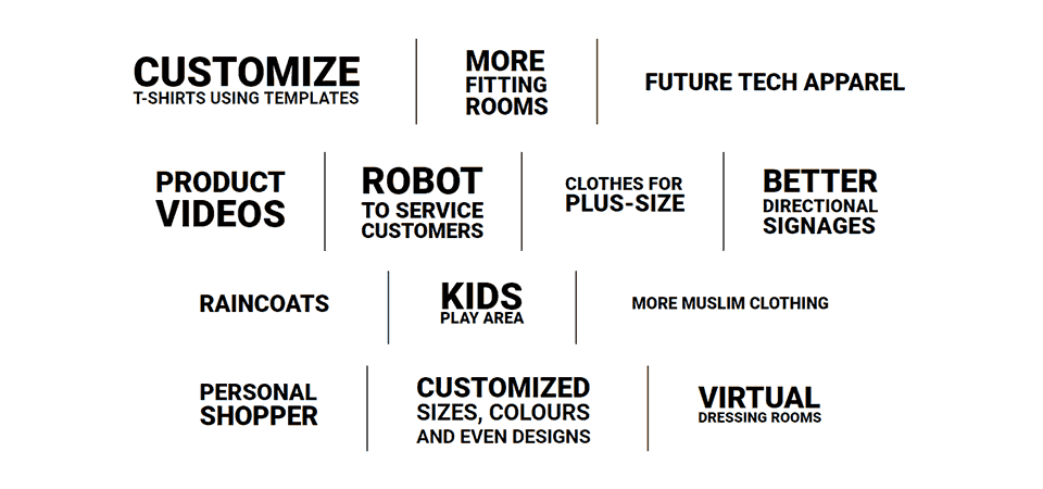
OTHER CONSIDERATIONS
Some suggestions by interviewees and survey respondents for a better shopping experience with Uniqlo. Food for thought indeed.
FINAL THOUGHTS
Although asking the user to test the interactive mirror/kiosk prototype on desktop could not convey the actual experience of being in a retail store, the endeavour was an interesting ‘proof of concept’. I still have much to learn when it comes to kiosk user interface design but I am excited by the prospect of creating an engaging brand touchpoint.
There are many mirrors in a Uniqlo retail store and I can imagine the engagement possibilities of just one being interactive.
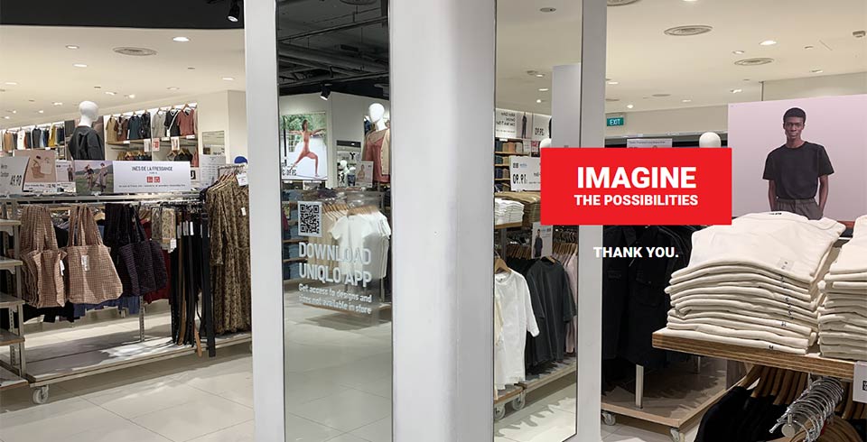
PRESENTATION DECK
Click the image below to download my project presentation deck (PDF, 9MB)